本文所讨论的中心点为: 如果"不定宽元素"内有"宽度为百分数的 img", 浏览器将如何计算容器和 img 的实际宽度.
注意:
1 除非提及,本文所有代码以 Chrome75 的效果为准.
2 本文中的"不定宽元素"是一个自造词,详见"不定宽元素"一节.
另外,本文是 stackoverflow 上这个讨论的总结,推荐直接去看原文.
举例:
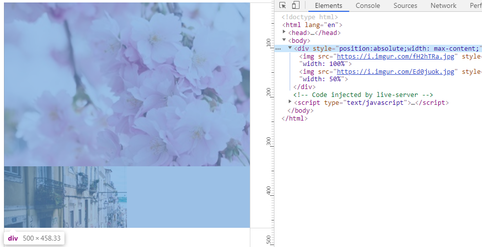
有一个浮动元素(以下记为container):
1 | <div class="container" style="float: left"></div> |
container 中有一些图片, 当图片的 width 值为百分比时,浏览器如何计算 container 和 img 的宽度?
1 | <!DOCTYPE html> |
最终结果很有趣:
- #container 的实际宽度为 500px
- #img1 的实际宽度为 500px
- #img2 的实际宽度为 250px
不定宽元素
注意: 本文中的"不定宽元素"是一个自造词,用来代指其宽度由内容决定的元素.
例如:
绝对定位元素
1 | <div style="position:absolute;"></div> |
内联块元素
1 | <div style="display:inline-block;"></div> |
浮动元素
1 | <div style="float:left;"></div> |
shrink-to-fit(收缩至适应宽度)
如果未声明元素宽度(width: auto),部分元素会使用 shrink-to-fit width 作为元素的实际宽度.
If 'width' is computed as 'auto', the used value is the "shrink-to-fit" width.
如果没有指明宽度,则使用 shrink-to-fit width 计算实际的宽度值.
CSS2/visudet/zh-hans - HTML5 Chinese Interest Group Wiki
shrink-to-fit width的计算方式如下:
shrink-to-fit width = min(max(preferred minimum width, available width), preferred width)
以下元素会采用 shrink-to-fit width 来计算实际宽度:
- Floating, non-replaced elements: 浮动,非替换元素(float)
- Absolutely positioned, non-replaced elements: 绝对定位,非替换元素(position: absolute|fixed)
- 'inline-block', non-replaced elements in normal flow: 内联块,非替换元素(display: inline-block)
另外在 CSS3 中, 这些名词有不同的叫法:
| CSS2 | CSS3 | CSS3 对应的样式 |
|---|---|---|
| preferred minimum width | min-content size | width: min-content |
| preferred width | max-content size | width: max-content |
| available width | stretch-fit size | width:-webkit-fill-available |
| shrink-to-fit width | fit-content size | width: fit-content |
fit-content size 的计算公式如下,其实和 CSS2 一样:
fit-content size = min(max-content size, max(min-content size, stretch-fit size))
CSS Intrinsic & Extrinsic Sizing Module Level 3
实际宽度的计算方式
通常来讲, 样式 width: <precentage> 的实际宽度相对于 containing block (包含块)计算.
但在某些情况下, 包含块的宽度由子元素决定,子元素的宽度又依赖包含块.
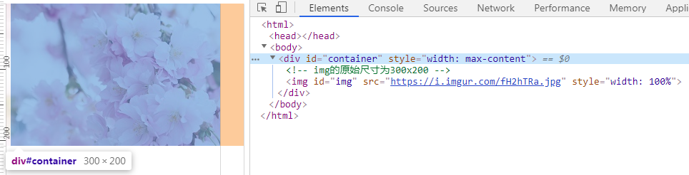
例如:
浮动元素 #container 内有一个 #img.
因为 float,container 有多宽取决于内部的 img.
但是 img 的 width 值是个百分数, 也就是 img 有多宽取决于外部的 container.
如此下去,就变成死循环了.
1 | <style> body {margin: 0;} </style> |
为了解决这个问题, CSS3 是这样做的:
When calculating the containing block’s size, the percentage behaves as auto.
忽略百分比的 width 值, 当作 width: auto 来处理.
CSS Intrinsic & Extrinsic Sizing Module Level 3
相当于:
1 | <img id="img" src="https://i.imgur.com/fH2hTRa.jpg" style="width: 100%" /> |
也就是,根据"图片的原始宽度"(300px)来计算 #container 的宽度.
这里又有了一个新问题.
上文提到了不定宽元素的宽度计算公式是: min(max(preferred minimum width, available width), preferred width).
那么, 这个"图片的原始宽度"(300px)会被带入到 preferred minimum width | available width | preferred width 这三个值中的哪个呢?
(本文假设 body 的宽度 width 为 1366px)
available width 指的是外层包含块的宽度, 即#container的父元素body的宽度(1366px). 因此排除available width:
1 | min(max(preferred minimum width, 1366), preferred width) |
preferred minimum width 和 preferred width 不太好判断,所幸 CSS3 提供了 min-content 和 max-content.
通过这两个属性值,可以直接得到 preferred minimum width 和 preferred width 的结果.
下面写两个demo看一下
preferred width:
1 | <div id="container" style="width: max-content"> |
preferred width的结果如下(300px),和图片的原始宽度一致.
preferred minimum width:
1 | <div id="container" style="width: min-content"> |
preferred minimum width的结果如下, 是0?
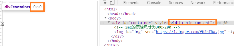
如上图所示, preferred minimum width 的结果非常奇怪.所以我又写了几个测试:
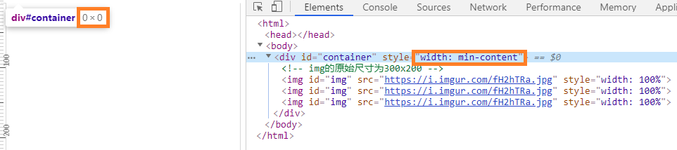
1 先多加几个图片试试看
1 | <div id="container" style="width: min-content"> |
结果如下图,还是0.
2 加个字母进去试试
1 | <div id="container" style="width: min-content"> |
可以看到,这回图片能显示了.并且 #container 的宽度为其内部"最长单词的宽度".
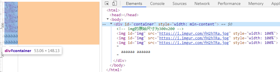
根据如上的两个 demo 可以假设, 在这种特定的情况下(不定宽元素内存在百分比宽度的img).
Chrome 在计算 #container 元素的 preferred minimum width 时,忽略了内部"百分比宽度的" img, 将这些图片的宽度当作 0 来处理.
因此,#container元素的fit-content size为300px:
1 | min(max(0, 1366), 300) = 300 |
Firefox的计算方式
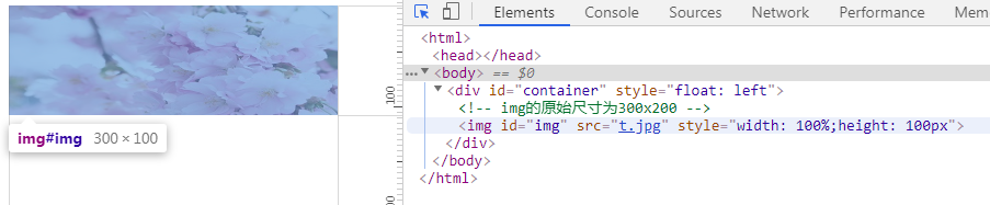
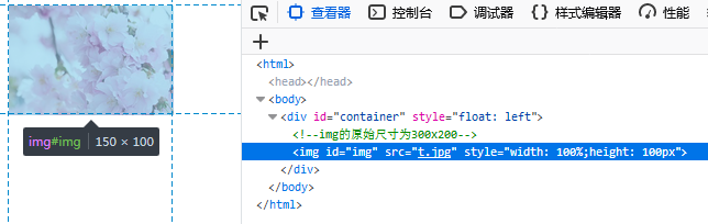
Chrome将图片的原始宽度作为 preferred width 处理,不考虑其高度(height),但是 Firefox 不同.
Firefox 会先计算 img 的高度(height), 然后根据图片原始的宽/高的比例来计算 preferred width.
例如如下这段代码:
1 | <div id="container" style="float: left"> |
图片元素的尺寸为 300x200,比例大约是 1.5:1.
忽略 width 后, 火狐会根据height(高度)和比例值计算宽度,也就是 100 * 1.5 = 150.
因为, 图像的最终宽度为 150px.
Chrome 的结果:
Firefox 的结果:
值得一提的是, img 元素的宽度计算了两次.
第一次计算发生在 container 的宽度确定之前,用于确定 container 的宽度.
第二次计算发生在 container 的宽度确定之后,用于确定 img 自身的宽度.
参考
css - Why are the results of img width different in some browsers? Who is correct? - Stack Overflow
CSS2/visudet/zh-hans - HTML5 Chinese Interest Group Wiki
Visual formatting model details
CSS Intrinsic & Extrinsic Sizing Module Level 3
理解CSS3 max/min-content及fit-content等width值 « 张鑫旭-鑫空间-鑫生活
width - CSS(层叠样式表) | MDN