移动端浏览器的地址栏是可动的,用户向上滑动页面时, 地址栏也会向上移动,直到隐藏.
如果想固定地址栏,可以使用如下样式:
1
2
3
4
5
6
7
8
9
10
| html {
height: 100%;
overflow: hidden;
}
body {
height: 100%;
margin: 0;
overflow-y: scroll;
}
|
表现
在chrome(android 73)中,上面这个办法可能会失效.
如果某个可滚动的绝对定位元素的尺寸和浏览器窗口一样大,可能会导致导航栏上移.
该bug仅能在android中复现, ios系统的chrome无此问题.
1
2
3
4
5
| <body>
<div class="fixed">
<div class="content"></div>
</div>
</body>
|
1
2
3
4
5
6
7
8
9
10
| .fixed {
position: fixed;
top: 0;
left: 0;
right: 0;
bottom: 0;
height: 100%;
background: red;
overflow-y: scroll;
}
|
.fixed是一个可滚动的定位元素, 大小和浏览器窗口一样大.
尽管给html设置了oveflow. 但是当滚动.fixed元素时, 还是会导致导航栏上移.
解决办法
1 修改绝对定位元素的大小
例如:
1
2
3
4
5
6
7
| .fixed {
top: -1px
}
// or
.fixed {
left: -1px
}
|
2 修改绝对定位元素的位置
1
2
3
4
5
6
7
| .fixed {
transform: translateX(-1px)
}
// or
.fixed {
transform: translateY(-1px)
}
|
3 设置opacity样式值小于1
1
2
3
4
| // or
.fixed {
opacity: 0.999;
}
|
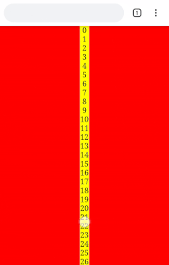
示例代码
1
2
3
4
5
6
7
8
9
10
11
12
13
14
15
16
17
18
19
20
21
22
23
24
25
26
27
28
29
30
31
32
33
34
35
36
37
38
39
40
41
42
43
44
45
46
47
48
49
50
51
52
53
54
55
| <!DOCTYPE html>
<html lang="en">
<head>
<meta charset="UTF-8">
<meta name="viewport" content="width=device-width, initial-scale=1.0">
<meta http-equiv="X-UA-Compatible" content="ie=edge">
<title>Fixed address bar</title>
<style>
html,
body {
height: 100%;
overflow: hidden;
margin: 0;
}
.fixed {
position: fixed;
top: 0;
left: 0;
right: 0;
bottom: 0;
opacity: 0.999;
background: red;
overflow-y: scroll;
}
.content {
text-align: center;
width: 20px;
margin: auto;
background: yellow;
}
</style>
</head>
<body>
<div class="fixed">
<div class="content"></div>
</div>
<script>
const contentEl = document.querySelector('.content')
let counter = 0
while (counter < 100) {
const el = document.createElement('div')
el.innerText = counter
contentEl.appendChild(el)
counter++
}
</script>
</body>
</html>
|