- clientWidth|clientHeight 元素内容可视部分的宽度/高度,不包括 滚动条 border margin
- offsetWidth|offsetHeight 元素整体宽度/高度,包括滚动条和border,不包括margin
- scrollWidth|scrollHeight 元素内容实际宽度/高度,包含被隐藏的部分
示例
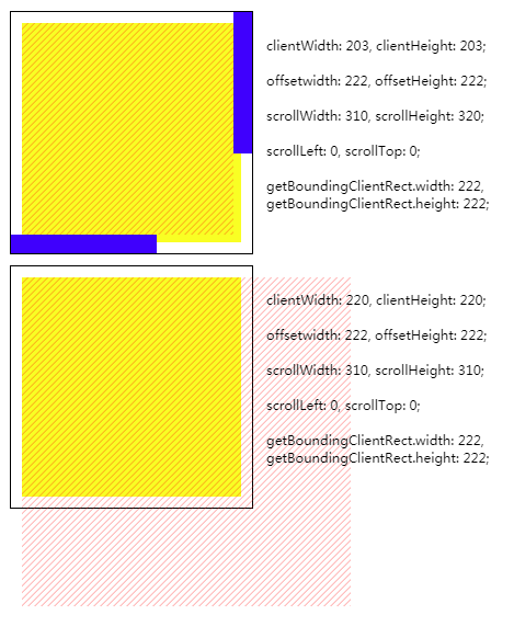
如上所示,两容器元素的宽/高均为200px, border为1px,padding为10px. 背景颜色为黄色, padding无颜色
两容器内均有一斜线为背景的子元素,其宽/高均为300px
容器1的overflow属性值为auto(可滚动).滚动条宽度为17px,颜色为蓝色
容器2的overflow的属性值为static(默认值,无滚动条)
clientWidth长度的计算不包含滚动条.当容器有滚动条时,clientWidth值为203px(220px - 17px).没有滚动条时,clientWidth值为220px
在chrome中,padding-right不参与scrollWidth值的计算.而padding-bottom相反,参与scrollHeight值的计算.因此, 可滚动元素的scrollWidth为310px,scrollHeight为320px
1
2
3
4
5
6
7
8
9
10
11
| <div class="overflow">
<div class="container c1" id="c1">
<div class="child"></div>
</div>
<pre class="info" id="i1"></pre>
</div>
<div class="container c2" id="c2">
<div class="child"></div>
</div>
<pre class="info" id="i2"></pre>
</div>
|
1
2
3
4
5
6
7
8
9
10
11
12
13
14
15
16
17
18
19
20
21
22
23
24
25
26
27
28
29
30
31
32
33
| .container {
overflow: auto;
border: 1px solid;
padding: 10px;
width: 200px;
height: 200px;
margin: 5px;
float: left;
background: #ff0;
background-clip: content-box;
}
.c2 {
overflow: visible;
}
.child {
width: 300px;
height: 300px;
background-image: url('data:image/svg+xml,%3Csvg width=\'6\' height=\'6\' viewBox=\'0 0 6 6\' xmlns=\'http://www.w3.org/2000/svg\'%3E%3Cg fill=\'%23ff0000\' fill-opacity=\'0.4\' fill-rule=\'evenodd\'%3E%3Cpath d=\'M5 0h1L0 6V5zM6 5v1H5z\'/%3E%3C/g%3E%3C/svg%3E');
}
.overflow {
overflow: hidden;
}
::-webkit-scrollbar {
width: 17px;
height: 17px;
background: transparent;
}
::-webkit-scrollbar-thumb {
background-color: blue;
}
::-webkit-scrollbar-corner {
display: none;
}
|
1
2
3
4
5
6
7
8
9
10
11
12
13
14
15
16
17
18
19
20
21
| var c1 = document.querySelector('#c1')
var bound1 = c1.getBoundingClientRect()
document.querySelector('#i1').innerText = `
clientWidth: ${c1.clientWidth}, clientHeight: ${c1.clientHeight};
offsetwidth: ${c1.offsetWidth}, offsetHeight: ${c1.offsetHeight};
scrollWidth: ${c1.scrollWidth}, scrollHeight: ${c1.scrollHeight};
scrollLeft: ${c1.scrollLeft}, scrollTop: ${c1.scrollTop};
getBoundingClientRect.width: ${bound1.width},
getBoundingClientRect.height: ${bound1.height};
`
var c2 = document.querySelector('#c2')
var bound2 = c1.getBoundingClientRect()
document.querySelector('#i2').innerText = `
clientWidth: ${c2.clientWidth}, clientHeight: ${c2.clientHeight};
offsetwidth: ${c2.offsetWidth}, offsetHeight: ${c2.offsetHeight};
scrollWidth: ${c2.scrollWidth}, scrollHeight: ${c2.scrollHeight};
scrollLeft: ${c2.scrollLeft}, scrollTop: ${c2.scrollTop};
getBoundingClientRect.width: ${bound2.width},
getBoundingClientRect.height: ${bound2.height};
`
|
- clientLeft|clientTop 元素border-left/border-top的宽度,没有则返回0.不包括margin/容器元素的padding
- offsetLeft|offsetTop 元素到距离最近的包含块的left/top padding edge的距离
示例
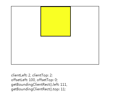
如上图所示,外层容器元素宽/高均为200px, margin-left为100px
容器元素内有一个宽/高均为100px的黄颜色子元素,其边框宽度为2px
子元素的clientLeft属性值为2,和边框宽度相同
offsetLeft属性为为100,和外层容器元素的margin-left值相同
1
2
3
4
5
6
7
8
9
10
11
12
13
14
15
16
17
18
19
20
21
22
23
24
|
<div id="box">
  <div id="item"></div>
</div>
<pre class="info" id="info" style="height: 100vh"></pre>

<style>
  body {
    margin: 10px;
  }
  #box {
    width: 200px;
    height: 200px;
    border: 1px solid;
    position: relative;
    padding-left: 100px;
  }
  #item {
    width: 100px;
    height: 100px;
    background: #ff0;
    border: 2px solid;
  }
</style>
|
1
2
3
4
5
6
7
8
| var el = document.querySelector('#item')
var bound = el.getBoundingClientRect()
document.querySelector('#info').innerText = `
clientLeft: ${el.clientLeft}, clientTop: ${el.clientTop};
offsetLeft: ${el.offsetLeft}, offsetTop: ${el.offsetTop};
getBoundingClientRect().left: ${bound.left},
getBoundingClientRect().top: ${bound.top};
`
|
- scrollLeft|scrollTop 元素横向/纵向滚动的距离.如果无法滚动,则返回0
注:
1 拥有属性oveflow:hidden的元素也可以滚动
2 该属性可写,如果值大于最大可滚动距离,则视为最大可滚动距离.如果值小于0,则视为0
3 在chrome中,可滚动元素的padding-bottom也参与纵轴可滚动距离的计算
示例
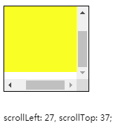
如上图所示,可滚动容器元素的宽/高均为200px,padding值为10px
可滚动容器元素内有一宽/高均为120px黄颜色子元素
将容器元素的滚动条拉到最右/下,可以发现scrollLeft和scrollTop并不相同
因为在chrome中,padding-right不参与可滚动距离的计算,而padding-bottom相反,参与可滚动距离的计算
1
2
3
4
5
6
7
8
9
10
11
12
13
14
15
16
17
18
19
20
21
| <div id="box">
<div id="item"></div>
</div>
<pre id="info"></pre>
<style>
body {
margin: 10px;
}
#box {
width: 100px;
height: 100px;
border: 1px solid;
overflow: auto;
padding: 10px;
}
#item {
width: 120px;
height: 120px;
background: #ff0;
}
</style>
|
1
2
3
4
5
6
| var el = document.querySelector('#box')
el.scrollTop = 100
el.scrollLeft = 100
document.querySelector('#info').innerText = `
scrollLeft: ${el.scrollLeft}, scrollTop: ${el.scrollTop};
`
|
Window.innerWidth|pageXOffset|screenX|outerWidth|scrollX
- innerWidth|innerHeight 视口的宽度/高度.包括滚动条,不包括书签栏 边框
- outerWidth|outerHeight 浏览器宽度/高度,包括标签栏 边框
- pageXOffset|pageYOffset 文档在水平/垂直方向的滚动距离
- scrollX|scrollY 同pageXOffset|pageYOffset
- screenX|screenY 浏览器在显示器中的位置
注: window没有scrollLeft|scrollTop属性,使用pageYOffset代替.
类似window.pageYOffset的有document.documentElement.scrollLeft|scrollTop(移动端不可用 ?)
示例
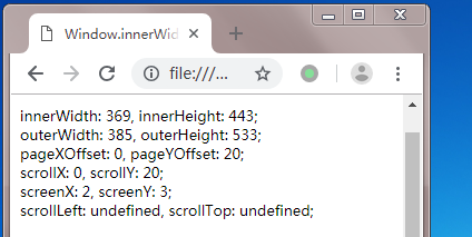
如上图所示, window对象的outerWidth属性比innerWidth多了一点,这个差就是浏览器边框的宽度
pageYoffset和scrollY都表示文档纵向滚动的距离,二者没有区别.出于兼容性的考虑,推荐使用pageYoffset
调用scrollLeft和scrollTop都返回了undefined,window对象没有这两个属性
上图示例代码:
1
| <pre class="info" id="info" style="height: 100vh"></pre>
|
1
2
3
4
5
6
7
8
9
10
| window.scrollTo(0, 20)
document.querySelector('#info').innerText = `
innerWidth: ${window.innerWidth}, innerHeight: ${window.innerHeight};
outerWidth: ${window.outerWidth}, outerHeight: ${window.outerHeight};
pageXOffset: ${window.pageXOffset}, pageYOffset: ${window.pageYOffset};
scrollX: ${window.scrollX}, scrollY: ${window.scrollY };
screenX: ${window.screenX}, screenY: ${window.screenY};
scrollLeft: ${window.scrollLeft}, scrollTop: ${window.scrollTop};
`
|
window.innerWidth 和 document.documentElement.clientWidth的区别:
innerWidth包含滚动条,clientWidth的区别不包含滚动条
event.clientX|offsetX|pageX|screenX|x
- clientX|clientY 相对视口左上角的坐标
- offsetX|offsetY 相对目标元素left/top padding edge的坐标
- pageX|pageY 相对文档的坐标
- screenX|screenY 相对于显示器的坐标
- x|y 同clientX|clientY
示例
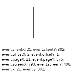
clientX|clientY相对于视口的位置计算,而pageX|pageY则相对于整个文档的位置计算
因此,向下滚动文档时, clientX|clientY发生变化,而pageX|pageY不变
另外,clinetX|clientY和x|y的表现完全相同
注意: offsetX/offsetY 永远相对于触发事件的元素计算(而非目标元素, 即使在捕获阶段触发事件也没用).如果目标元素中有子元素,则应使用clientX和getBoundingClientRect代替,例如
1
| el.clientX - el.getBoundingClientRect().left
|
示例代码
1
2
3
4
5
6
7
8
9
10
| <div id="box"></div>
<pre id="info"></pre>
<style>
#box {
width: 100px;
height: 100px;
border: 1px solid;
margin-top: 100vh;
}
</style>
|
1
2
3
4
5
6
7
8
9
| document.querySelector('#box').onclick = function(event) {
document.querySelector('#info').innerText = `
event.clientX: ${event.clientX}, event.clientY: ${event.clientY};
event.offsetX: ${event.offsetX}, event.offsetY: ${event.offsetY};
event.pageX: ${event.pageX}, event.pageY: ${event.pageY};
event.screenX: ${event.screenX}, event.screenY: ${event.screenY};
event.x: ${event.x}, event.y: ${event.y};
`
}
|
参考
web前端学习笔记---scrollWidth,clientWidth,offsetWidth的区别 - 白色的海 - 博客园
CSSOM视图模式(CSSOM View Module)相关整理 « 张鑫旭-鑫空间-鑫生活