参考
eep dive CSS: font metrics, line-height and vertical-align
vertical-align和line-height的关系 张鑫旭
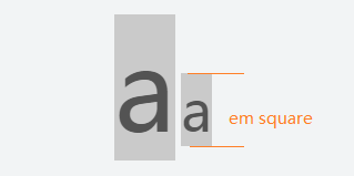
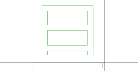
em框(em square)
字符的em框大小受font-size影响,字符尺寸越大,em框越高.
.baseline-0 span {
  background:#ccc;
  color: #555;
}
<p class="baseline-0">
  <span style="font-family: Microsoft YaHei;font-size: 100px;">a</span>
  <span style="font-family: Microsoft YaHei;font-size: 50px;">a</span>
</p>
</p>
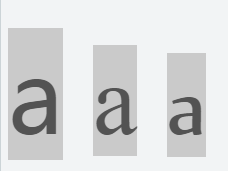
但实际上,尽管设置了字体大小为100px,还是会发现,字体em框的高度其实是不一样的.
这是因为,em框高度实际上是由字体自己的参数设置决定的,每个字体都不一样.
.baseline-1 {
    font-size: 100px;
}
.baseline-1 span {
    background:#ccc;
    color: #555;
}
<p class="baseline-1">
    <span style="font-family: "Microsoft YaHei">a</span>
    <span style="font-family: "Times New Roman">a</span>
    <span style="font-family: "Nyala">a</span>
</p>
拿微软雅黑为例,当em size 为1000时,Win Ascent为1058,Win Descent为262.
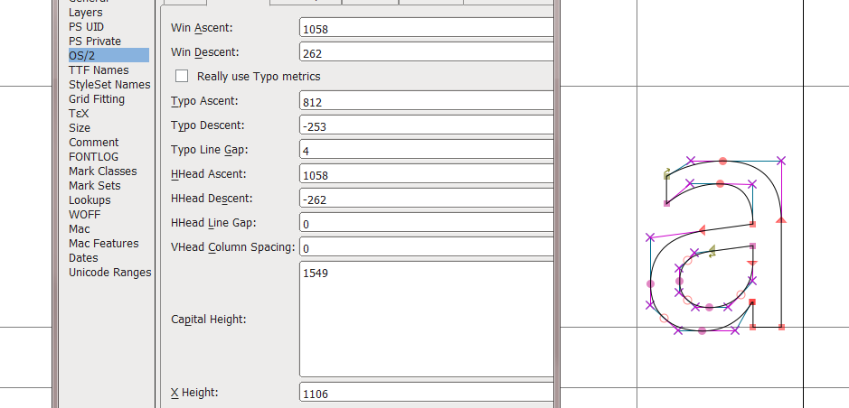
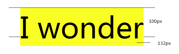
也就是说,当设置微软雅黑的font-size属性值为100px时,实际em框高度为132px(1058 + 262).
.contain-4 {
    border: 1px solid;
    border-left: 0;
    border-right: 0;
    width:500px;
    height:100px;
    font-size: 100px;
    text-align: center;
}
span {
  background:yellow;
}
<p style="" class="contain-4">
  <span>I wonder </span>
</p>
注:可以把em框理解为字符未设置padding时的background大小.
可以通过设置padding撑起字符的background,但这绝不代表em框的大小被改变了.
基线 baseline
基线是西方字体设计中的概念.英文字符长短不一,为了使这些字符对齐,规定一条直线,让大多数字符坐在这条线上.每种字体的基线位置也是各不相同.
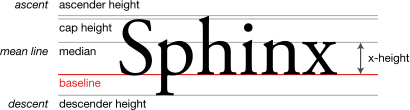
中文字体本来没有基线这个概念,方块字直接对齐就好了.但到了现代,出于中西文混排,标点位置的考虑,还是会在字体设计时,指定一条基线.
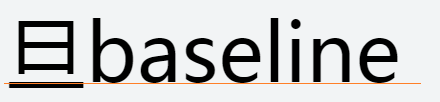
用FontForge字体处理软件可以查看字体的基线位置
inline-block 元素的基线位置
行内替换元素(inline-block)也有基线,
如果内部有内容,那么"其内部最后一个子元素的基线"就是它的基线.
如果内部没有元素或overflow值不为visible,那么他的基线位于margin-bottom底端.
行高 line height
行高就是文本行的高度,默认情况下根据font-size计算.
例如文本的font-size值为16px,那它的默认行高为16px(浏览器的默认行高各不相同,firefox是1.1,chrome是1.2).
如果为行高指定一个固定值,那无论怎么改font-size,行高都不受影响.
如下所示,更改字体大小后,行高仍然是100px.
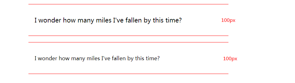
.contain-2 p {
    border: 1px solid red;
    width: 600px;
    line-height:100px;
}
<div class="contain-2">
    <p style="font-size: 20px">I wonder how many miles I've fallen by this time?</p>
    <p style="font-size: 12px">I wonder how many miles I've fallen by this time?</p>
</div>
行间距(leading)
line-height和font-size的差被称为行间距
行间距分为两部分,这两部分被称为半间距(half-leading),分别位于内容区顶部和底部
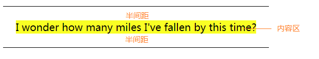
也可以理解为行高为"上下半间距高度"加"文本元素高度"之和.
如果容器高度为100px,容器内文本的font-size为20px,文本元素的上下半间距高度为40px(假设,没办法直接设置半间距高度).
那么行高就是100px(20px + 40px + 40px),因为文本被两个空白的半间距夹在中间,因此看起来文本就像居中了一样.
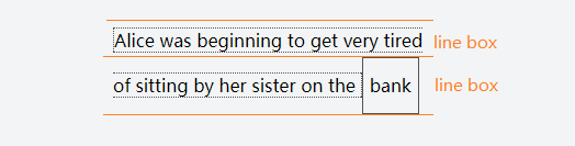
行框(line box)
可以把行框想象成一个盒子,这个盒子只能装一行内容.如果放不下,那么他会自动拆分成多个盒子,这些盒子一个接着一个,垂直堆放.
这个盒子(行框)的高度为,盒子里所有子元素最高点到最低点.
vertical-align
vertical-align可用于定义inline|inline-block元素在垂直方向上的对齐方式
vertical-align:
    baseline 元素基线与父元素基线对齐(默认值)
    top 元素顶端与所在行顶端对齐
    bottom 元素底端与所在行底端对齐
    middle 元素中垂线与父元素的基线加上小写x一半的高度值对齐
    text-top 元素顶端与父元素(line box)字体顶端对齐
    text-bottom 元素底端与父元素(line box)字体底端对齐
    sub 元素基线与父元素下标基线对齐
    super 元素基线与父元素上标基线对齐
    % | em | rem | px 以父元素基线为基准点上下移动,移动距离相对line-heihgt计算
top对齐行框顶端
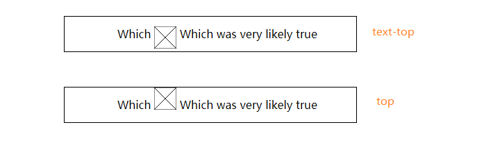
text-top也是顶端对齐,但其参照物是父元素(line box)的font-size.
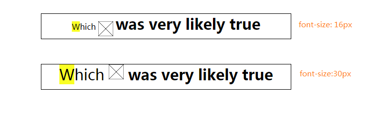
如下图所示,两行文本中有一个30x30的img,行中部分字体被b标签加粗,加粗字体大小为30px.
设置行一容器font-szie值为16px,行二容器font-szie值为30px.
可见行一的行框(line box)被加粗字体撑起,但img未跟随其上浮,仍然跟左侧未加粗字体顶端对齐.
div[class|="container"] {
    border: 1px solid black;
    height:50px;
    margin:50px;
    width:500px;
    text-align:center;
}
div:first-letter {
    background:yellow;
}
b {
    font-size:30px;
}
img {
    width:30px;
    height:30px;
    vertical-align:text-top;
}
.container-5 span {
    font-size:16px;
}
.container-6 span{
    font-size:30px;
}
<div class="container-5">
    <span>
        Which
        <img src="https://mdn.mozillademos.org/files/12245/frame_image.svg">
        <b>was very likely true</b>
  </span>
</div>

<div class="container-6">
    <span>
        Which
        <img src="https://mdn.mozillademos.org/files/12245/frame_image.svg">
        <b>was very likely true</b>
    </span>
</div>